Some history
Let me start with a story.
Back - what, three and a half years ago? almost four - in the mists of ancient time, a strange site wandered into private and then public beta. We weren't like any site that had been seen before. We were trying to be a community of artists and writers and game designers and illustrators and storytellers and, most of all, people who do these things for fun. That's the important bit; while fun often gets in the way of Q+A, most of us are building worlds and helping others do the same as a hobby. Not a job.
Stack Overflow is kind of a polar opposite. It's a community of both programmers who have been working for decades and are older than many modern languages and novices who might just be here for a single semester of an intro CS class. There are plenty of people who sometimes program for the fun of it (Hi there!), but many, many people need to get something done, often for work. The no-nonsense, even minimalist design - and here I'm talking about the site art - works well there. For me, when I pop over, that's great. I'm getting a job done, and it could be important for what work I'm doing, and I don't need or want fun or whimsy.
Worldbuilding Stack Exchange will never - and must never - be Stack Overflow.
When I joined in October of 2014, shortly after public beta opened up, I didn't think the site would survive. Well, maybe that feeling really came to a head in 2015. We had struggled with the problem of multiple answers since the beginning, wrestled with good and bad subjectivity, and were marching towards problems with What-If questions. Knowing that our scope alone made us kind of unique was always something that nagged me.
Thanks to support from Stack Overflow, Inc. - namely, giving us a chance - and the ground other sites had trodden before, we made it. I can't tell you how extraordinary that felt. Graduation means a heck of a lot to any site, but for us - for me, at least - it gave us validation. It validated the idea that our extraordinarily non-Stack-Overflow-esque scope, model and strategy could work. We didn't just have data and experiences; we had our benevolent overlords themselves telling us we could be, and were, successful. That was just . . . wow.
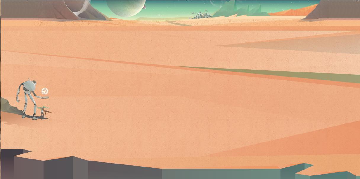
Then the site design process started, and the ensuing weeks were absolutely wild. We have graphic designers and artists and skilled illustrators in the house, and I think people applied their skills and imaginations to create some awesome things. You know how the banner of our site has that futuristic city in the distance, and mountains to the left? That was made by a user, DaaaahWhoosh. The idea of having a planet for an icon even came from multiple people (1, 2). Most of all, though, I think we all knew that whimsy was going to have to play a part in things.
And it worked!
What with the new, streamlined designs, it feels like we're just a version of Stack Overflow with some color changes and a small banner slapped on top. And . . . that kinda hurts, given the struggles we've had and the work people went through to help contribute to the site design.
What I don't like
Now for some specific critiques.
Banner
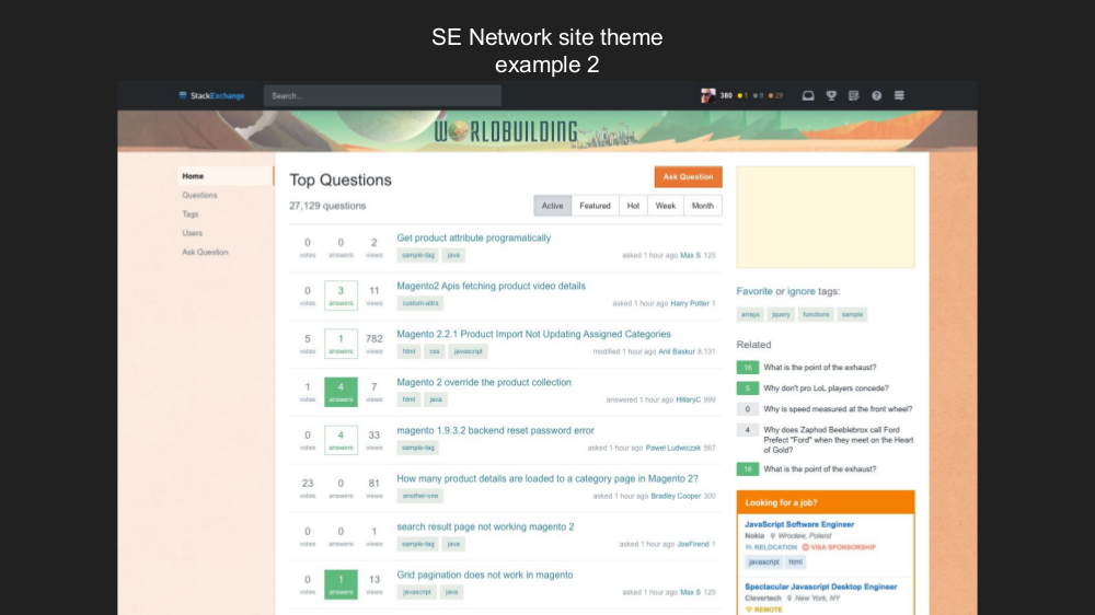
Right now, with the proposed changes, it feels like ~90% of the design and personality is squeezed into the banner . . . which is much, much smaller than it currently is, and much smaller than it should be. I know this is something that would affect all the sites, and I know it's probably too late to write it up as an answer on Meta Stack Exchange, but still. . . I wish we could have more room for the banner - and especially the site name. I feel like it's trapped.

Sidebar
I'm okay with the sidebar on Stack Overflow, when I'm sometimes switching between the main site and Teams, but I don't really like it here. It feels . . . I don't know. It takes up a lot of space, and takes away from the art, which I'll continue to complain about below. Like I said, it feels too businesslike. We need a bit of whimsy.
Side colors
I'm not a fan of the sides; as I think I said above, they feel like mere color changes from the base template (which is, I suppose status-by-design). Most importantly, they don't match. What's up with that? I would really, really like to have the same color - preferably one that flows better from the ground in the header, not just a change of orange. I'd like 'em to be more like terrain. With the old design, it kind of feels like you're walking on the surface of the planet.
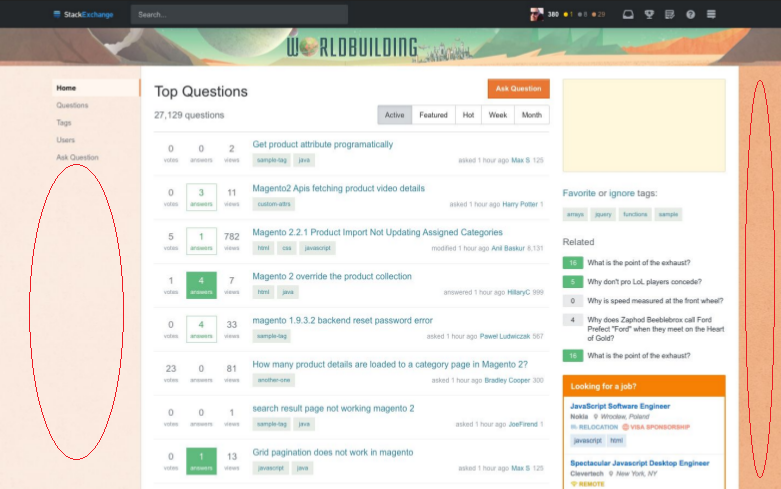
I would love to keep the current sites, which aren't just monochromatic, but if we have to lose them, it would be nice to have a single color that matches the rest of the design.
Slartibotfast and Pandora
Yes, the robot and heroine have names . . . because the woman accompanying the robot is, of course, the protagonist of the story the old design tells. We like the duo so much that we tried to name them. They are a huge part of the design and feature prominently on our blog, Universe Factory. I wholeheartedly agree with Mithrandir's suggestion to keep them:
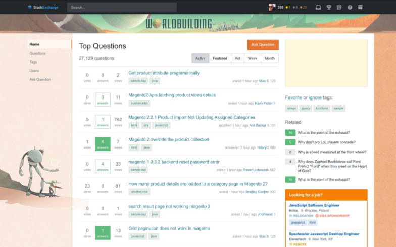
SAVE THE ROBOT! And Pandora.
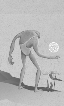
Also, Mike Nichols pointed out that the meta site has some changes, not merely the grayscale coloring. For instance, Slartibotfast is replaced by an alien. This sort of thing would also be great to keep.
In summary
I know this question was primarily about saving the robot, but I got a bit carried away. So if I had to boil down my argument for the things I'd like to change about the proposed designs, I'd say this:
- We are a site of whimsy and merriment.
- All good merrymakers like relevant site designs that showcase personality.
- Our personality needs to show in the site banner . . . but doesn't.
- The sides are extraordinarily important, but have lost everything.
I moderate a number of sites, and have been with many sites since the beginning. I have yet to encounter a more passionate community than the one on Worldbuilding. I mean, there's a huge sense of community pride and interest in supporting and promoting the site - see again our blog. We have decent activity in chat, and, most importantly, meta is pretty active. In other words, people care to a degree I haven't experienced firsthand on any other site I've participated on. We're not unique in this, but still. It's kinda heartwarming.
I know that it's going to be a couple weeks before the new design gets applied to Worldbuilding. I know that there will be a time and a place for voicing these concerns. I also know that some/most of the things I talked about here can't be implemented. So this is all wishful thinking. But can we at the very, very least - if we're gonna lose a lot of things that make our site what it is - for the sake of Glarnak keep Slartibotfast and Pandora?



worldbuilding.meta.stackexchange.comsite. $\endgroup$