104
$\begingroup$

I'm Kurtis, a product designer at Stack Exchange. First off, congratulations on your recent site graduation!

Graduation and Your Site Design

Graduation comes with a few perks. We have already begun work on your site's design based on the community's ideas so that the design gives you a unique theme that reflects your topic and culture. This will help brand your site as unique, even while you share common elements with other sites that show you are part of a bigger Stack Exchange family.

Design Concept

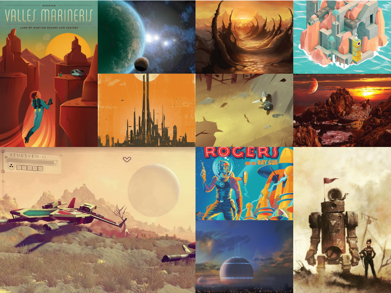
We were inspired by all of the different ideas posted in the meta discussion and the community's Medium blog. Thanks to everyone who participated. As we began to design here are just a few highlighted ideas we kept in mind...

"draw continents that are clearly not directly inspired by any of those on Earth"

"While worldbuilding is serious stuff, we're also a whimsical community."

"By our nature we get questions on a wide range of topics and covering a wide range of "realisms", from planets in binary star systems with actual science all the way through magical worlds that follow no known laws of nature."

"On the bottom, there's kind of like a holodeck-esque tear in reality to suggest that this world is not yet finished."

Worldbuilding mood board

Worldbuilding mood board

Color Scheme

Color swatches

For the color scheme we chose a palette with an otherworldly feel. We wanted colors that might exist in nature but not on earth.

Logo Concept

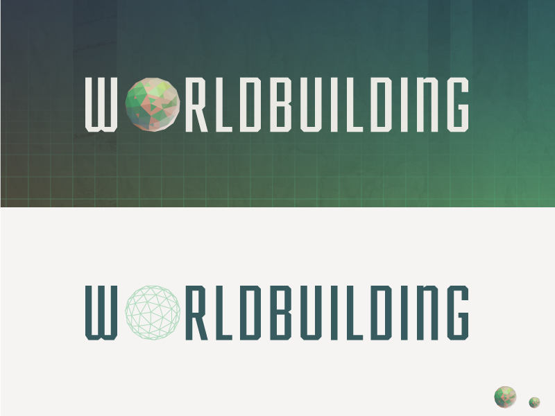
Worlbuilding Logo brainstorming ideas

A visual for the logo that recurred during brainstorming was an unfinished world being crafted by a tool or hand. We started the logo design with this idea but the addition of a tool or hand added complexity at a smaller size. We then began to think about the role of the human brain and our unique ability to shape fictitious worlds.

Worldbuilding Logo concept

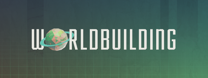
Drawing inspiration from a brain scan that showed neural activity during the act of imagining, we combined that with a primitive sphere. The shape represents the beginning of an idea not fully formed in its complexity, while the bodies of water abstractly represent the imagination.

Worldbuilding Logo

Visual theme

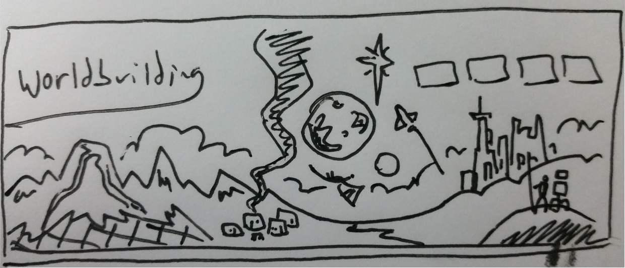
DaaaahWhoosh's sketch

Early on we took inspiration from the imagery in DaaaahWhoosh's sketch. We starting the design with a poster that we would later reassemble into a site design because it gave us a little more creative freedom to explore a theme.

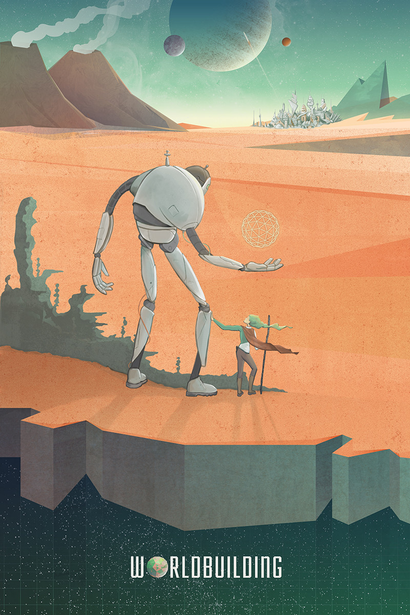
Worldbuilding Poster

Not all elements of the original sketch made it into the poster, but we had the idea that if the design for the main site gets approved by the community, we could treat the meta theme as an alternate dimension to the one displayed below — a black and white version that includes some of the more primitive elements that were discussed in the brainstorming post. For instance, the robot could be a dragon-esque creature and the city could be medieval. (Yes, it would include a balloon whale.)

Swag

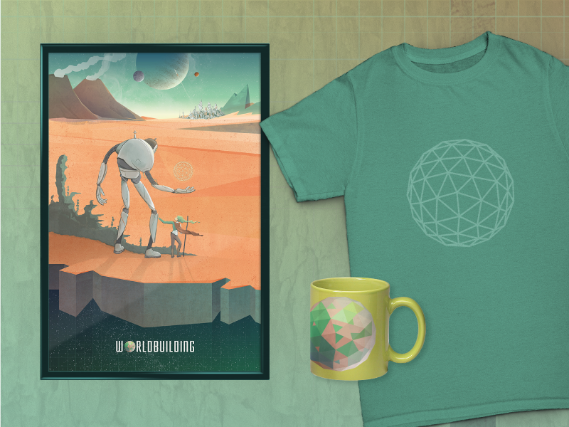
Worldbuilding poster, t-shirt, and coffee mug

Above are a few potential examples of Worldbuilding swag.

Overall Site Design

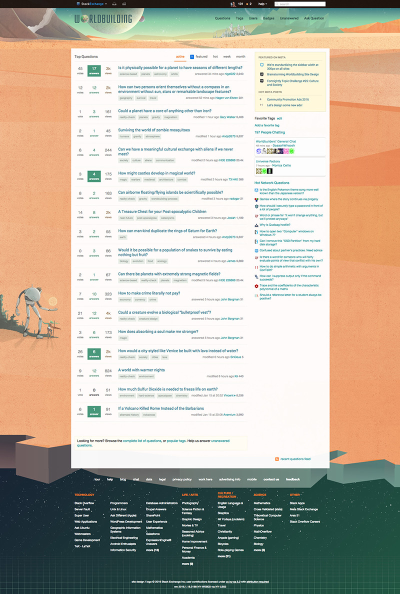
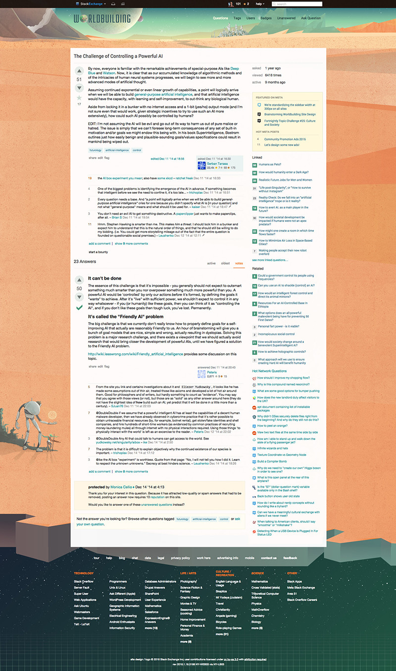
For the site design, we downplayed many of the visual elements in the poster and kept much of the artwork in the header and footer.

Click images to view larger versions.

Worldbuilding home page

Worldbuilding question page

We believe the design captures the mood we were going for and would love to hear your feedback. If there are no major design changes, we're hoping to launch the site soon!

Thank you for for making this such a great community!

$\endgroup$
52
  • 26
    $\begingroup$ Very cool! And a lot of thought obviously went into this, like using a brain scan during the act of imagining -- kudos! $\endgroup$
    – Monica Cellio Mod
    Commented Jan 19, 2016 at 15:37
  • 3
    $\begingroup$ I gotta say I love the design and I will be looking into what it would take to get a scale model of the robot made up... $\endgroup$
    – James
    Commented Jan 19, 2016 at 15:56
  • 8
    $\begingroup$ I also really like the idea of meta being "same but different" -- not just gray-scale but changing some of the design elements as you suggested. $\endgroup$
    – Monica Cellio Mod
    Commented Jan 19, 2016 at 15:58
  • 6
    $\begingroup$ Nice. My only concerns are that it might be a bit too "in your face" for people browsing from work and that the image as it stands is very "sci fi" (in fact it very much reminds me of old school sci fi novel covers which is pretty cool), while we cover fantasy, sci fi and everything in between. Would it be possible to rotate the image between a couple of different versions? Or maybe have the same scene as fantasy or sci-fi and split it in half between them or something. $\endgroup$
    – Tim B Mod
    Commented Jan 19, 2016 at 17:20
  • 4
    $\begingroup$ Also the t-shirt swag seems a bit...plain...something like the poster on a t-shirt though would be epic :) $\endgroup$
    – Tim B Mod
    Commented Jan 19, 2016 at 17:21
  • 10
    $\begingroup$ You know what on-theme swag item that poster art would look really great on? A sketchbook. $\endgroup$
    – Monica Cellio Mod
    Commented Jan 19, 2016 at 22:09
  • 3
    $\begingroup$ Also, I love the idea of meta being a black and white alternate dimension! Go for it! $\endgroup$
    – ArtOfCode
    Commented Jan 19, 2016 at 23:56
  • 3
    $\begingroup$ @Keale Worldbuilding is officially awesome. (If you don't want to read the whole thing, it's just below the image just below the "So, why the change?" heading.) $\endgroup$
    – user Mod
    Commented Jan 20, 2016 at 8:38
  • 3
    $\begingroup$ @Keale we had a backlog of graduated/graduation-due sites to design. our design team has been trying hard to clear the log recently! $\endgroup$
    – Jin
    Commented Jan 20, 2016 at 14:50
  • 8
    $\begingroup$ A balloon whale, perhaps? I really like balloon whales. $\endgroup$
    – Kurtis Beavers Staff
    Commented Jan 20, 2016 at 16:00
  • 7
    $\begingroup$ I would consider mixing the overt fantasy and sci-fi elements. You've mentioned that the Meta would have a medieval city and a dragon - why not have a steel city and a dragon in the meta, with the towers and robot in the main site? Or visa versa. I just think that breaking up the supposedly similar items would give a stronger impression of the variety that we have here. $\endgroup$
    – Jerenda
    Commented Jan 24, 2016 at 4:22
  • 5
    $\begingroup$ Thank you all for the feedback. We'll append the post above this week with design updates. $\endgroup$
    – Kurtis Beavers Staff
    Commented Jan 25, 2016 at 13:58
  • 6
    $\begingroup$ @KurtisBeavers Just for good measure... if you could add another post instead of updating the current one, we could use some comparison. And it gets cleaner. $\endgroup$ Commented Jan 26, 2016 at 7:00
  • 4
    $\begingroup$ @KurtisBeavers, check this out when you get a moment; I think you'll enjoy it. :-) medium.com/universe-factory/… $\endgroup$
    – Monica Cellio Mod
    Commented Feb 9, 2016 at 19:07
  • 4
    $\begingroup$ I know you probably hear it much too often, but... is there any plan on when we could get the updated version? $\endgroup$ Commented Feb 22, 2016 at 21:23

11 Answers 11

71
$\begingroup$

Suggestion: add a planetary ring to the logo

I like the logo but feel like it doesn't have much of a silhouette, which makes it seem very generic at smaller sizes. The fact that the colours start to blend together at small sizes doesn't help either.

I'd suggest you add a planetary ring to it, this would make it immediately recognisable as a planet and make it stand out more at any size.

The logo could also possibly do with a bit more strongly saturated red/orange, especially for the smaller sizes.

Edit:

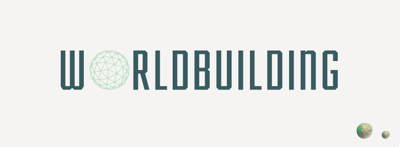
I've made a quick (and very bad) mock-up of what the logos could look like with a ring (with no additional adjustments):

logos with ring, large logos with ring, small

I feel like it's an improvement, though obviously some more thought and care needs to go into the exact placement, color and look of the rings.

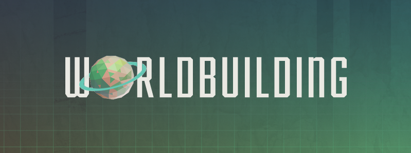
Here's what the name could look like:

worldbuilding name with new logo

Or possibly:

worldbuilding name with new logo, ring goes through the letters

$\endgroup$
11
  • 5
    $\begingroup$ Now I see it I like it, I wonder what it would look like with the ring going through the W and R in Worldbuilding too (as in passing through the gaps in the letter). $\endgroup$
    – Tim B Mod
    Commented Jan 21, 2016 at 12:58
  • $\begingroup$ @TimB I made a quick mock-up, it's horrible but gets the idea across I think. The ring is a bit off centre, so I had to pull the W in a little closer, this could be solved with more care put into the logo. The ring does become a bit thin, but this might be nice; for this image I just erased part of the ring so it looks a tad wonky. $\endgroup$
    – overactor
    Commented Jan 21, 2016 at 13:11
  • 1
    $\begingroup$ I think I like that, it ties the elements together. $\endgroup$
    – Tim B Mod
    Commented Jan 21, 2016 at 13:18
  • 12
    $\begingroup$ I like the idea. We're going to give the community a few more days for feedback then will post revisions. $\endgroup$
    – Kurtis Beavers Staff
    Commented Jan 21, 2016 at 14:31
  • 11
    $\begingroup$ When I got to the first image that placed it with the text I said to myself "no, it has to go through the R, not behind it". Then I got to the second one. :-) $\endgroup$
    – Monica Cellio Mod
    Commented Jan 21, 2016 at 16:53
  • 6
    $\begingroup$ I like the going through as well ! $\endgroup$ Commented Jan 21, 2016 at 19:39
  • 1
    $\begingroup$ It's a hell of a nice touch! $\endgroup$
    – AndreiROM
    Commented Feb 8, 2016 at 14:52
  • 2
    $\begingroup$ Well this is Worldbuilding, so why should it be a simple planetary ring? Why not a Möbius strip or something very different? $\endgroup$
    – Medi1Saif
    Commented Feb 11, 2016 at 7:23
  • $\begingroup$ @Medi1Saif While I do love myself a mobiüs strip here and there, it might be a little bit extravagant. Or at least, complicated. $\endgroup$ Commented Mar 17, 2016 at 5:18
  • $\begingroup$ I think the ring should only go through the R, not the W. Take the first image, weave it through the R but otherwise leave the ring alone. I think that would look better, as it would create more depth and thus interest in the image. Weaving through both letters looks a bit strange and destroys the illusion of depth, which was more present in the first concept you drafted (I think.) $\endgroup$
    – user9182
    Commented Apr 2, 2016 at 12:35
  • $\begingroup$ Actually, I think it looks nicest if the ring is simply above both letters: i.cubeupload.com/vObiJ9.png $\endgroup$
    – user9182
    Commented Apr 2, 2016 at 14:17
15
$\begingroup$

Just some personal thoughts.

Worldbuilding cover a wide range of topics and while I know it might not be easy to make several themes fit in the site design, I feel that the actual one as proposed focuses too much on science-fiction. Other popular themes that could be incorporated would be medieval, steampunk and fantasy (as in magical stuff).

Also, I feel the desert is a bit empty. How about adding some vegetation maybe through terraforming? It could be alien Cyan-ish plants, to fit with the color palette.

$\endgroup$
3
  • 3
    $\begingroup$ OR it could be sentient plants! Because why not! I agree with this answer, and because @DonyorM suggested giving this greater publicity, I would like repeat my suggestion above: swap the steel towers on the main site with the planned medieval city on the Meta. That mixes up the supposedly similar elements and gives a greater impression of our variety. (Please feel free to incorporate my suggestions into your answer if you agree.) $\endgroup$
    – Jerenda
    Commented Jan 28, 2016 at 2:34
  • 1
    $\begingroup$ I kind of like the empty feel. It suggests there is a world that needs built! $\endgroup$
    – Ansible
    Commented Feb 8, 2016 at 20:07
  • $\begingroup$ how about adding building scaffolds somewhere? Tough in general empty space makes for better design... to much detail detracts from the point. $\endgroup$
    – joojaa
    Commented May 30, 2016 at 7:39
12
$\begingroup$

Make the world in the logo a little bigger.

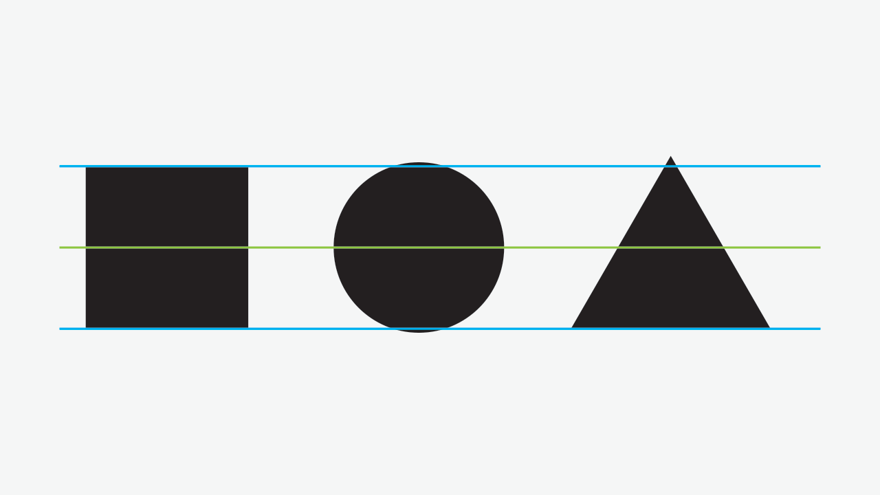
From a visual perspective, the world in the logo could be a little bigger to make it have equal weight to the other letters in my opinion, especially in the non-colored version.

Here's a rough, low quality example of what it'd look like (top - original on bottom):

enter image description here

enter image description here

The new version is currently at 107% of the old size, but could be fine tuned more.

The example below shows how making the circle a little bigger evens out the visual weight:

enter image description here

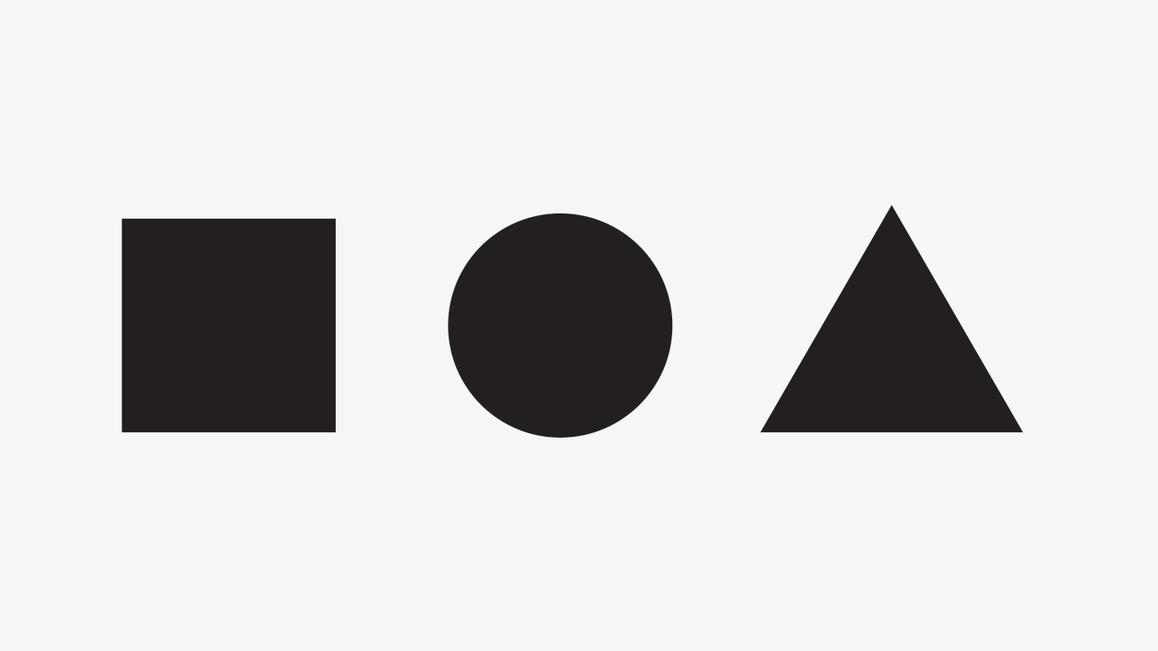
Without guides:

enter image description here

For more information, see this post on GD.SE.

$\endgroup$
6
  • $\begingroup$ I am not exactly sure whether this typographic principle translates well to odd elements in logos, which have an increased visual weight anyway. But it’s certainly worth testing. (For the Meta logo however, you are probably right.) $\endgroup$
    – Wrzlprmft
    Commented Jan 20, 2016 at 19:05
  • $\begingroup$ @Wrzlprmft It's a visual design principle, not just type :) $\endgroup$ Commented Jan 20, 2016 at 19:07
  • 5
    $\begingroup$ Cool - I'd never seen that principle before. To my eye, I think you're right; making it actually bigger than the other letters make it visually the same size. $\endgroup$
    – Jaydles Staff
    Commented Feb 17, 2016 at 16:58
  • $\begingroup$ In your example images I can quite obviously tell that the triangle is substantially larger (taller) than the other two shapes, so I'm not quite sure what those images were meant to show. However, I still agree completely with your idea of increasing the size of the planet in the logo, that is (to me) a necessity. $\endgroup$
    – user9182
    Commented Apr 9, 2016 at 11:06
  • $\begingroup$ @theonlygusti The point of making the triangle a little taller in the example is to give a visual balance to the composition :) $\endgroup$ Commented Apr 9, 2016 at 12:31
  • $\begingroup$ @ZachSaucier That's what I'm saying; to me, it doesn't look visually balanced, The triangle is blatantly and disproportionately larger than the other two shapes. However I agree that the circle does look much better when optically aligned, which was the message of this post. $\endgroup$
    – user9182
    Commented Apr 9, 2016 at 13:19
10
$\begingroup$

I think I mostly like it. I don't think the different levels of details in the different elements is a disadvantage, here; a bit like Monica Cellio, I think it sort of makes a point of showing that not everything has to be "pixel perfect". There comes a point at which the perfect is the enemy of the good enough, and as worldbuilders, we should be aware of that point.

Two things, though, stand out to me as could use a bit of improvement.

  • The orange is really strong off to the sides, and personally I find it a bit distracting, possibly even to the point of being annoying. Could that color be toned down (possibly just desaturated) slightly? (Please? Pretty please? With chocolate chip cookies? It's a well-known fact that all artists love chocolate chip cookies.) I don't mind orange per se, but right now it feels a bit too much "in your face".
  • The contrast between the tag names and tag name background is IMO too low in the question list. Can we use the same colors for that in the question list as in the question view (which I think are much better)? Alternatively, maybe just darken the tag name text somewhat in the question list, to make it easier to read, if you don't want to change the background. I can understand why we wouldn't want the tags to overshadow the question title, but at present I really think we need a bit more contrast for those who have less-than-stellar monitors and maybe not the best eyesight.
$\endgroup$
3
  • 3
    $\begingroup$ Good call on the tag contrast. I hadn't noticed that they were different in the two views, and the single-question one is a lot easier to see. $\endgroup$
    – Monica Cellio Mod
    Commented Jan 19, 2016 at 21:53
  • 1
    $\begingroup$ Just as a data point, the orange doesn't bother me. I also wouldn't mind much if it were toned down just a tad. A significant desaturation would eb a shame in my opinion though. $\endgroup$
    – overactor
    Commented Jan 22, 2016 at 9:08
  • $\begingroup$ If there are contrast complaints already, could this also be run past some people with various kinds of colour blindness before being finalised? $\endgroup$ Commented Feb 9, 2016 at 15:53
7
$\begingroup$

A nitpick that I have with both the poster and the site design: The planets, robot and humanoid have light and shadows that appear to be coming from different light sources. The light source appears to be just below the horizon in the centre of the poster, between the city and the volcanoes, yet if you draw a line from the centre of the planets to the brightest-looking edge, they point at the city, and the figures' shadows point all over the place if you trace them back from the direction they point to the light source.

Getting this right would necessitate rotating the planets a little so that their brightest edges were pointing to the (unseen) light source, and orienting the figures' shadows correctly.

Obviously, you can't just reduce and relocate the two figures with their shadows for the site design - the shadows would have to be re-oriented, but the site design has a less obvious light source anyway, so it doesn't matter so much there.

I agree with overactor that the logo needs something more, like a ring - perhaps a ring that is incomplete, like a letter "C" rather than an implied letter "O", where the ends of the gap in the "C" is pixelated as if it is unfinished. If close to the sphere and angled at 45 degrees, the ring could still fit into the icon's square without reducing the size of the sphere significantly.

The T-Shirt logo should be in full colour like the mug logo, not just the wireframe as is currently the case.

$\endgroup$
1
  • $\begingroup$ Really? I kind of like minimalistic wireframe design for the shirt. It's simple yet elegant. $\endgroup$
    – fi12
    Commented Mar 12, 2016 at 14:47
6
$\begingroup$

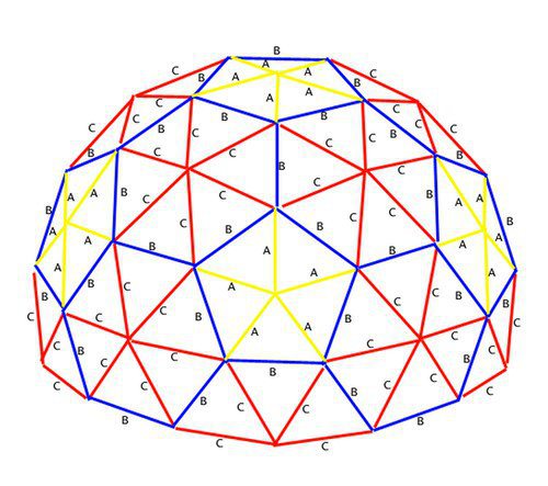
I made a comment but I'll promote to an answer so I can add an illustration

enter image description here

Your mesh seems to have off-center positions with lines being uneven lengths. The picture I Posted here is a dome not a full sphere, but you can see that the placement of the nodes is uniform. geodessy in mechanics means that the forces are all in compression or tension, without torque or twisting going on.

$\endgroup$
5
  • 4
    $\begingroup$ Planets aren't perfect sphere... and the brain certainly isn't ;-) $\endgroup$ Commented Jan 25, 2016 at 9:22
  • 2
    $\begingroup$ On this scale it's pretty close. A billiard ball is actually rougher than a scale globe the same size. But the sketch doesn't look like it represents a bumpy surface: it looks like odd placement guided along an imagined sphere. The filled version isn't lambert shaded, btw. $\endgroup$
    – JDługosz
    Commented Jan 25, 2016 at 9:25
  • 1
    $\begingroup$ I don't see it so badly, it could also be interpreted as the roughness of an as yet unfinished world. The shading could, indeedn, get some more thoughts to it. $\endgroup$ Commented Jan 25, 2016 at 9:34
  • 1
    $\begingroup$ Maybe I have a better sense of 3d geometry. Iac, if an actual model was used, wouldn't that be better? The lines woukd be correct for that underlying shape and the shading would match. $\endgroup$
    – JDługosz
    Commented Jan 25, 2016 at 9:37
  • 3
    $\begingroup$ My point is that it does not go into a sense of 3d geometry. But an opinion of visual design. Perfect shapes are often plain. So having some on-purpose deformed shape gives it a bit more character. But, hey, that's just IMHO. $\endgroup$ Commented Jan 25, 2016 at 9:43
3
$\begingroup$

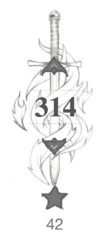
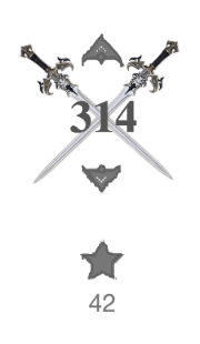
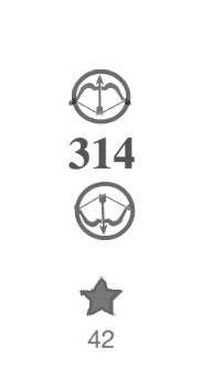
I'm sorry for posting an (almost) duplicate answer, but I can't edit other answers here.


I really like Erik's idea of stylising the voting arrows to incorporate other aspects of this site, for example medieval and fantasy themes.

I created some mock-ups of how some of my ideas:

enter image description hereenter image description hereenter image description here


Erik's original post was:

It might be fun to trade out the standard up/down arrows for either a sword or a fletched arrow. That would bring a medieval element to the theme, and reflect that blend of future and past that is common in many works.

So I'm imagining something more akin to my final design, with the voting buttons themselves swapped out for something else.

$\endgroup$
3
  • $\begingroup$ First of all I wish I was a good enough artist to be able to whip out something that good and consider it bad. :) I like all of these but the first one seems like it would obscure the voting buttons. The second one is very nice but I don't know if they will be willing to do it since no other site uses graphics in that spot to my knowledge. I like the last one too and think it is our best shot. Overall great work! $\endgroup$
    – Erik
    Commented Apr 2, 2016 at 14:37
  • $\begingroup$ not sure if swords are related to worldbuilding, but +1 for the art. The first sketch is awesome @_@ $\endgroup$
    – user8808
    Commented May 18, 2016 at 8:54
  • $\begingroup$ I didn't see these until just now but the artwork is awesome. Well done $\endgroup$
    – James
    Commented May 20, 2016 at 20:25
2
$\begingroup$

Really nice design overall some thoughts:

The world building logo works really badly in extremely small size. The browser icon is see is unreadable. The graphic could do with some changes for better visual readability.

  1. The ring should be bigger (in relation to sphere)

    • The ratio of planet and ring should be bigger. In other words the planet should be smaller than the ring.

    • This would help visually understand what is going on and the result is more easily recognizable by glance as the silhouette is more prominent

    • alternatively drop the ring all together.

  2. The tessellation on the sphere is hard to see in smallest sizes

    • Drop the tessellation level down when the size gets smaller. Possibly the logo could tessellate even more in posters but that is not necessary.

      enter image description here

      Image 1: Quick example of what I mean. Oh and while drawing this it seems that the tessellation is a bit erratic (its not a divided Truncated icosahedron as it initially seems)

    • This would give the logos structure more adaptability that would make the smaller sizes work better.

    • This becomes more critical if the the ring is dropped or stays the same size.

    • By decreasing tessellation you can keep lines thicker making them more defined.

    • For doing this well its better the sphere is actually a real geodesic than dropping detail would be more subtle and could be done on more levels. But yeah this might be overkill.

Other ideas for sake of brainstorming I dont think this matters much:

  • instead of ring make the lattice incomplete.

    This makes again the silhouette more recognizable. Meye fracturing along equator would make the brain analogy better and so on...

$\endgroup$
1
$\begingroup$

The logo looks to me like a die with a large number of faces used by web designers to pick between colors. (Which I wish I had thought of before, I really suck at picking colors.) I like the idea behind your derivation, I really do, but there is nothing in the finished logo to suggest a connection to either worlds or brain scans without reading your explanation of the derivation. Further this is "world building" not "coloring primitive spheres". So despite the derivation being good, the finished result doesn't really have any connection to the site.

Maybe you could make blend a planet and the primitive sphere with transition and maybe that hand working to show the site is about starting with primitive spheres and turning them into worlds?

The palette... Did I already mention I suck at picking colors? Sp I am not going to offere suggestions for a better palette or anything since I really suck at picking colors or palettes... Did I already mention it? But...

You write about picking a palette that is alien to Earth and suggests alien world and pick a palette with two earth colors, two muted vegetation colors and a stone color... I think I kind of get what your intent was. Start with the colors of the Earth and then adjust so they look unnatural which makes them look alien, right? But I don't think it is really working. Alien worlds have the same physics as ours does, so they have the same colors, bar the differences in the solar spectrum, but our brain actually compensates for that since it happens at dawn and dusk on Earth. So it just looks like an illustrator picked a "stylish" color palette, not colors of another world.

To clarify, there is nothing wrong with the palette. IMHO it looks just fine. I am just not sure if it was what you wanted, since it doesn't to me make the impression you wrote about.

That said, I am not sure if I already mentioned it, but I suck at picking colors, so you can safely ignore anything I say about colors and palettes, if you wish.

I am also not sure if the theme really suggest world building, it seems to suggest more exploration than construction, but... it does look nice so who cares...

$\endgroup$
4
  • 4
    $\begingroup$ You make good points but I largely disagree. I do agree that the logo could do with some improvement, but feel that the base idea is solid. You're right about the rationale not exactly shining through in the final design without an explanation, but I think it does feel right, which is more important. The palette, I think, works exactly as intended. The stone color might occur on earth, but is relatively foreign to most people, especially as abundantly as it is in the site design. The color of the atmosphere is (seemingly) plausible for an alien world, yet quite different from ours. $\endgroup$
    – overactor
    Commented Jan 22, 2016 at 8:51
  • 3
    $\begingroup$ As for the theme not suggesting construction of a world: you're right (aside from the unfinished edge at the bottom), but we don't really physically construct world either, do we? What this theme does display is a very odd world, there are multiple satelites and/or planets visible in the sky, there is major volcanic activity, space-faring mixed with some more primitive themes, there are glass mountains, there are robots and humans interacting with those robots. additionally, the world looks unfinished. It makes me want to figure out how this world works, which I think is a good sign. $\endgroup$
    – overactor
    Commented Jan 22, 2016 at 8:57
  • 1
    $\begingroup$ All in all I think worldbuilding is a difficult thing to capture in a nice looking design and this one does a very respectable job at it. That being said, I still do think you raise good points and I trust the designers will appreciate it and take it into account. $\endgroup$
    – overactor
    Commented Jan 22, 2016 at 8:59
  • 1
    $\begingroup$ Logo: agree the idea is fine, not sure about the feel. It might depend on whether you know what it is supposed to represent? Palette: As said it looks fine and I am not one to pick colors, so not going to argue there. I said what I wanted to say about that. Theme: as I said it suggests exploration not construction and I don't really have a problem with that. Absolutely agree on world building being a difficult concept to capture, of course. Mostly whining because I have done some site design and not getting clear feedback on any issues during design phase can be a real pain. $\endgroup$ Commented Jan 22, 2016 at 9:22
1
$\begingroup$

I don't know how this sounds, but how about a small spark of electricity when the vote buttons are clicked?

If that is OK, then we could have some more special effects like maybe a time travelling image while a post is loading, or an alien comic at a dead link.

$\endgroup$
1
  • 6
    $\begingroup$ Something tells me especially the latter would require a major adaptation of the code base. Also, such special effects have a tendency to degrade poorly unless very carefully designed, while for all intents and purposes the entire rest of the pages degrade very gracefully (use something like the Firefox Web Developer Toolbar to disable all Javascript, CSS and images, and observe that the site looks a lot less fancy but is certainly still navigable and reasonably readable -- then consider that that's how search engines see it). $\endgroup$
    – user Mod
    Commented Feb 2, 2016 at 17:22
0
$\begingroup$

It might be fun to trade out the standard up/down arrows for either a sword or a fletched arrow. That would bring a medieval element to the theme, and reflect that blend of future and past that is common in many works.

$\endgroup$
2
  • $\begingroup$ I like this idea, maybe the sword could be behind the voting buttons, I'll see if I an create a sketch. $\endgroup$
    – user9182
    Commented Apr 2, 2016 at 12:37
  • $\begingroup$ Check this: meta.worldbuilding.stackexchange.com/questions/2916/… I tried to create some mock-ups. $\endgroup$
    – user9182
    Commented Apr 2, 2016 at 13:51

You must log in to answer this question.

Not the answer you're looking for? Browse other questions tagged .