35
$\begingroup$

I'm Kurtis, and I'll be working on the new design for the graduated Worldbuilding site. As most of you are aware, each site within the Stack Exchange network gets its own unique theme while maintaining some consistency and common elements with the rest of the Stack Exchange family.

We're in the very early stage of brainstorming, but before we get too excited about the endless possibilities, we'd like your input on the overall direction.

A few things to consider:

  • We need to come up with an icon that is recognizable at all sorts of sizes including tiny.
  • Are there any ways that the site should visually connect with the medium blog?
  • How do we encompass all of the genres covered on the site without leaning too specifically toward one?
$\endgroup$
8
  • 3
    $\begingroup$ I'm going to use multiple answers to separate some ideas, for ease of voting and discussion. $\endgroup$
    – Monica Cellio Mod
    Commented Dec 17, 2015 at 18:27
  • $\begingroup$ It's in a comment down below somewhere, but I'll leave it here too: if you want information, or files, from the blog design, I'm happy to send what I've got. $\endgroup$
    – ArtOfCode
    Commented Dec 22, 2015 at 0:07
  • $\begingroup$ Do we also design our own "error=" page? That is to say, if it's on wb.se, but an old link, we can do our own error page design? $\endgroup$
    – Mikey
    Commented Dec 23, 2015 at 5:16
  • $\begingroup$ Whoa, we have a blog!? And it's going to influence our site!? $\endgroup$
    – PipperChip
    Commented Jan 4, 2016 at 4:14
  • 1
    $\begingroup$ @Mikey we should have the option to have custom art for the 404, captcha, and error pages. (The text is fixed, I believe.) I think the designers usually address those after the basic ideas of the site design have been worked out, but Kurtis can verify or correct that. $\endgroup$
    – Monica Cellio Mod
    Commented Jan 4, 2016 at 19:22
  • 1
    $\begingroup$ @PipperChip yes we have a blog -- check it out! $\endgroup$
    – Monica Cellio Mod
    Commented Jan 4, 2016 at 19:22
  • $\begingroup$ @MonicaCellio - awesome! I think this group will have fun with this, then (in a good way)! $\endgroup$
    – Mikey
    Commented Jan 5, 2016 at 4:31
  • $\begingroup$ @Mikey the error, captcha, and 404 pages all get their own custom images like this: movies.stackexchange.com/404 Ideas for those images are welcome $\endgroup$
    – Kurtis Beavers Staff
    Commented Jan 5, 2016 at 13:44

15 Answers 15

26
$\begingroup$

So, I think Monica and Frostfyre are on to something, but here's some ideas straight from my head to the paper to here:
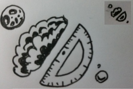
idea for icon

So this is a rough concept of an icon I came up with. In the center it's half a brain and a protractor, to represent how the topics here are a cross between science and imagination. Then the orbiting bodies are, well, orbiting bodies, moons of some sort, to give a somewhat more concrete implication that the circular object in the center is meant to be interpreted as a planet, and also to suggest that we deal with building worlds of all sizes. In the top right I've drawn a tiny version, to show that it works pretty well when that small (though I still don't know how to draw a brain).
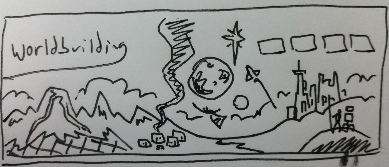
main top thing idea

So this would go on the top, you know, with the site name and all the buttons. There's a lot going on, so let's start from the left. On the bottom, there's kind of like a holodeck-esque tear in reality to suggest that this world is not yet finished. On top of that is a mountain range with a volcano, to suggest the beginning of things (initial planet formation, geographical changes due to active plate tectonics and a hot core). That plume of smoke is coming from a little primitive village. In the middle, on the ground, is a river, both because rivers are important to geography and civilization, but also to again represent how we as a community flow through a lot of different topics.

Above that is another planet, with a moon orbiting it, and a star to its upper right, this part symbolizes our focus on space and physics and all that. There's also a dragon and a spacceship, representatives of fantasy and science fiction.

To the right there are some hills, kind of an antithesis to the mountains to represent erosion and the changes to things over time. Behind the hills is a futuristic city, to match the primitive one on the left. In front of the hills, or really on top of one, we have a man with a spear looking to the sunset with a robot.

Oh, and behind everything there is just a bit of fog, or dust, or something. I just like having that extra layer, but it could represent the unknown, and again the fact that there are parts of this world that are yet to be explored.

I guess this mainly focuses on the duality of beginning and end, but I think it also does a decent job of incorporating most of the things we talk about here.

As for colors, I think there would be some, but as I'm vaguely colorblind I don't tend to worry much about them. I'm thinking pastels and simplicity would be nice; you know, something basic, yet inviting. A calming vista rather than a sharp one, to remind new users that we have some semblance of order we like to keep, and they should really go to the help center first.

But yeah, this just my idea. I don't really know how much symbolism actually works, but I like thinking about it.

An alternate option would be to use my avatar for everything. I would also be on board for that.

$\endgroup$
7
  • 1
    $\begingroup$ I like the banner concept -- thanks for writing/drawing this up! $\endgroup$
    – Monica Cellio Mod
    Commented Dec 18, 2015 at 14:13
  • $\begingroup$ These are great ideas! $\endgroup$
    – Jin
    Commented Dec 18, 2015 at 15:33
  • 4
    $\begingroup$ Id just like to note that it seems people dont like the icon as much as the banner. Which i agree with, the icon might need some revision. $\endgroup$ Commented Dec 19, 2015 at 22:40
  • 3
    $\begingroup$ Just a note: We can also create an icon to represent the community that doesn't have to live in the banner if it is competing with the banner artwork. $\endgroup$
    – Kurtis Beavers Staff
    Commented Dec 20, 2015 at 15:01
  • $\begingroup$ There's a lot of questions about magic (I think it was even a fortnightly theme once...) - might want to throw a wizard tower in the mountains! :D $\endgroup$
    – corsiKa
    Commented Jan 10, 2016 at 6:28
  • $\begingroup$ @corsiKa That's a good point, maybe the guy standing with the robot on the right can be a wizard holding a staff. $\endgroup$ Commented Jan 10, 2016 at 17:47
  • $\begingroup$ Coming back here after seeing the actual site design so far, I must say I much prefer your logo idea. $\endgroup$
    – user9182
    Commented Apr 2, 2016 at 14:03
22
$\begingroup$

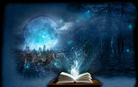
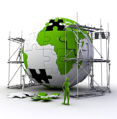
Personally, I think it would be great fun to have something like one of these two images for the background:

Worldbuilder at work

Fantastical world at play

The first one identifies our purpose as Worldbuilders in that we build worlds, often with painstaking detail. The second aligns with the often-fantastical nature of our products and identifies that what we do is meant more for fiction than reality.

(Both images above acquired via a Google image search.)

Our icon could be something like:

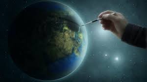
Hand holding a world

It's simple and identifies our hands-on approach to world development.

I can't speak to the blog, as I've not been involved in it. I wish I were, but I haven't had the time when I'm not at work and don't want to be there while at work when I have the time...

Source

$\endgroup$
3
  • 4
    $\begingroup$ +1 for the first image. Maybe even with a more obvious even finer precision tool? $\endgroup$
    – user Mod
    Commented Dec 18, 2015 at 12:02
  • $\begingroup$ I really like these suggestions. $\endgroup$
    – Tim B Mod
    Commented Dec 18, 2015 at 13:42
  • $\begingroup$ I like the first image, both the idea and the color palette. $\endgroup$
    – Monica Cellio Mod
    Commented Dec 27, 2015 at 16:35
16
$\begingroup$

I really like the coloring and feeling of @Frostfyre's first image. However, I suggest replacing the painter's hand with a scaffolding and construction workers. Basically, something that uses the world and the starry-nebuly background of his image, but the accents of the image below.

enter image description here

The workers can be more or less realistic looking, and possibly holding tools. The puzzle theme is optional (I'd go without it).

$\endgroup$
4
  • 8
    $\begingroup$ If going this route, maybe take a little time and draw continents that are clearly not directly inspired by any of those on Earth? (After all, questions about Earth as we know it only make up a tiny portion of our questions!) $\endgroup$
    – user Mod
    Commented Dec 18, 2015 at 17:43
  • $\begingroup$ Or make some of the puzzle pieces match an Earth location (Europe is small and recognizable) and some not. That would better indicate that someone can ask about Earth...or not. Or a globe that looks like Earth with Atlantis added. Or the header image is wide enough to show multiple worlds. $\endgroup$
    – Brythan
    Commented Dec 19, 2015 at 4:30
  • $\begingroup$ @MichaelKjörling: Better to recognise and realise may be a planet with a ring. $\endgroup$
    – Wrzlprmft
    Commented Dec 25, 2015 at 19:38
  • 2
    $\begingroup$ May be confusingly similar to the PUZZLE GLOBE service mark owned by Wikimedia Foundation. $\endgroup$ Commented Jan 2, 2016 at 18:41
15
$\begingroup$

The role of whimsy

While worldbuilding is serious stuff, we're also a whimsical community. (I mean, look at our popular questions! Facebook summoning Cthulhu? Physical properties of Santa's sleigh? We're doing real work but we're also having fun.) So if there's some way to convey a sense of whimsy in a small way in the design, that'd be cool. I don't know what that looks like. It should not overwhelm; we don't want to suggest to visitors that we're a joke site, because we're not.

$\endgroup$
3
  • 6
    $\begingroup$ Maybe a Balloon Whale in the corner of one of the images would add some whimsy? $\endgroup$
    – Tim B Mod
    Commented Dec 18, 2015 at 19:43
  • 1
    $\begingroup$ @TimB Ha! I'm one step ahead! Already got concept art for a balloon whale! $\endgroup$
    – mechalynx
    Commented Dec 21, 2015 at 16:01
  • 1
    $\begingroup$ Serious Stuff?? $\endgroup$ Commented Dec 23, 2015 at 1:45
13
$\begingroup$

Artistic theme

How do we encompass all of the genres covered on the site without leaning too specifically toward one?

I'm not sure we can encompass all of them, but I also think that's ok.

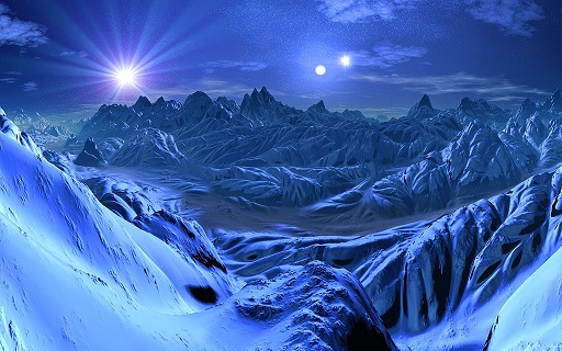
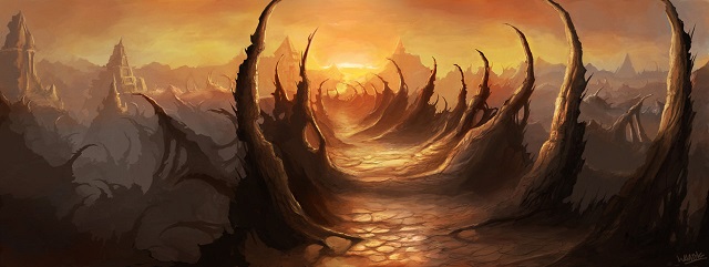
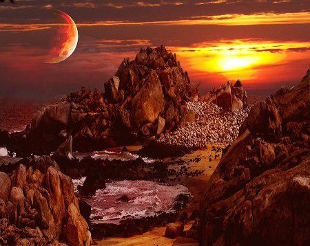
By our nature we get questions on a wide range of topics and covering a wide range of "realisms", from planets in binary star systems with actual science all the way through magical worlds that follow no known laws of nature. These worlds are inhabited by everything from people to AIs to elves flying on griffin-back. But whatever those worlds are like, they almost certainly involve a land (let's call it a planet) that probably has a sky with suns and/or moons and/or other things.

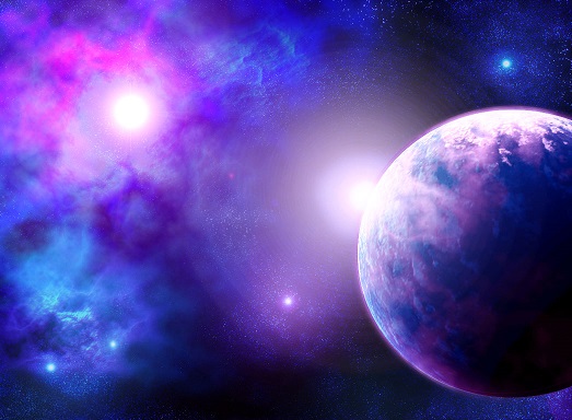
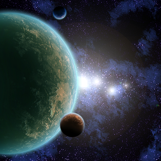
So to me, the concept of worldbuilding is captured well by an alien landscape (with suns/moons/nebulas/? visible in the sky, which probably isn't blue). It's also captured well by an "arial" view of a planet clearly not Earth in a system clearly not ours. I think that even if you're designing a medieval-oid fantasy world with wizards and dragons, this could still resonate. I don't think my RPG questions would be out of place on a site whose design revolves around an alien landscape with two moons in the sky, for instance.


I was asked for some images to illustrate the kinds of things I'm thinking of. These are meant to be evocative, not literal -- when I think of "worldbuilding" these are the kinds of pictures that come to my mind.

Alien landscapes:

alien landscape

another alien landscape

red planet

"Arial" views (i.e. showing whole planets/stars/etc):

planet in nebula

planet with moons

$\endgroup$
2
  • $\begingroup$ Where did you find these images?? $\endgroup$
    – user Mod
    Commented Dec 18, 2015 at 12:01
  • $\begingroup$ @MichaelKjörling Google image search (except for the first landscape, which ArtofCode used on the blog). I searched for things like "alien landscape" and "planet with two moons" and "nebula". The URLs are in the revision history; unfortunately, the only way I could shrink them (they were pretty big) was to edit them, which meant a fresh upload to imgur. $\endgroup$
    – Monica Cellio Mod
    Commented Dec 18, 2015 at 14:12
13
$\begingroup$

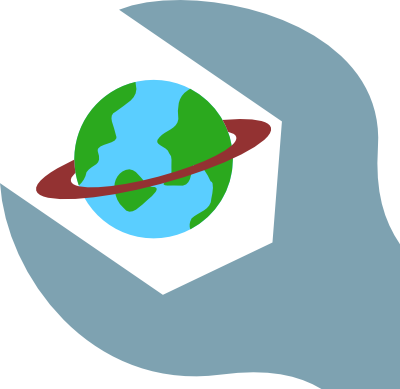
Just throwing out some idea for an icon that could work on tiny sizes:

Logo sketch

Just to give you an idea, here is the icon at 16×16 (which is the size of hot-network-question icons):

16×16

I know, it has flaws in its current state, but I hope that it’s apparent that with tuning, it may work on this size.

$\endgroup$
3
  • 5
    $\begingroup$ Likely not a winner (people like the painter painting the planet more), but I respect the simplicity of the wrench around a planet which will retain resolution when scaled down to 16 or so pixels. Very evocative. $\endgroup$ Commented Dec 28, 2015 at 16:17
  • 1
    $\begingroup$ Reminds me of Clamp Industries, from Gremlins 2. Not a helpful connection! $\endgroup$
    – CAgrippa
    Commented Jan 1, 2016 at 14:26
  • $\begingroup$ At first I thought the wrench was a human head and the world was a brain. If a good artist could pull that off, it would be amazing! $\endgroup$
    – corsiKa
    Commented Jan 10, 2016 at 6:30
11
$\begingroup$

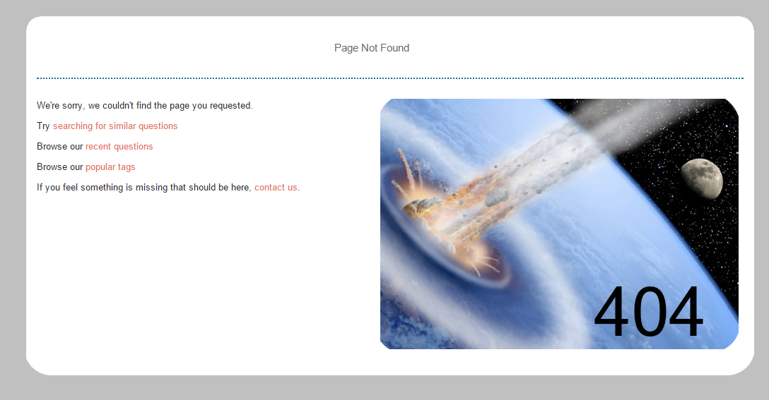
I'm told in the comments that we can have an Error 404 unique page. Can I propose something similar (I am not a graphics person, just threw this together) to the below? It seems that the text can't be changed, but the location of "Page Not Found" can be centered - I'm not sure about that.

enter image description here

$\endgroup$
3
  • 3
    $\begingroup$ Actually, there are three specific pages: /error, /404 and /captcha. Your image suggests itself for /error, while for /404 I would suggest showing planet-less space. $\endgroup$
    – Wrzlprmft
    Commented Jan 17, 2016 at 9:45
  • 1
    $\begingroup$ @Wrzlprmft - ah! I am not savvy. Then I would suggest this for the error page. $\endgroup$
    – Mikey
    Commented Jan 17, 2016 at 17:41
  • $\begingroup$ @Wrzlprmft Perhaps when Hans Solo doesn't find Alderaan in Star Wars? :P $\endgroup$
    – Zizouz212
    Commented Feb 17, 2016 at 18:13
10
$\begingroup$

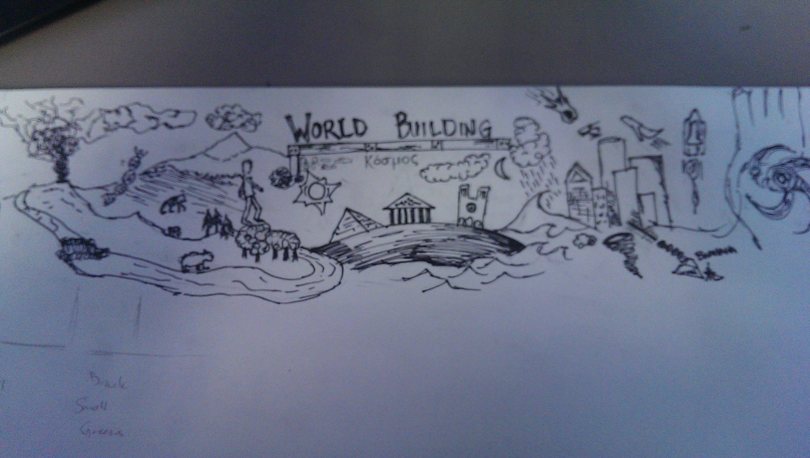
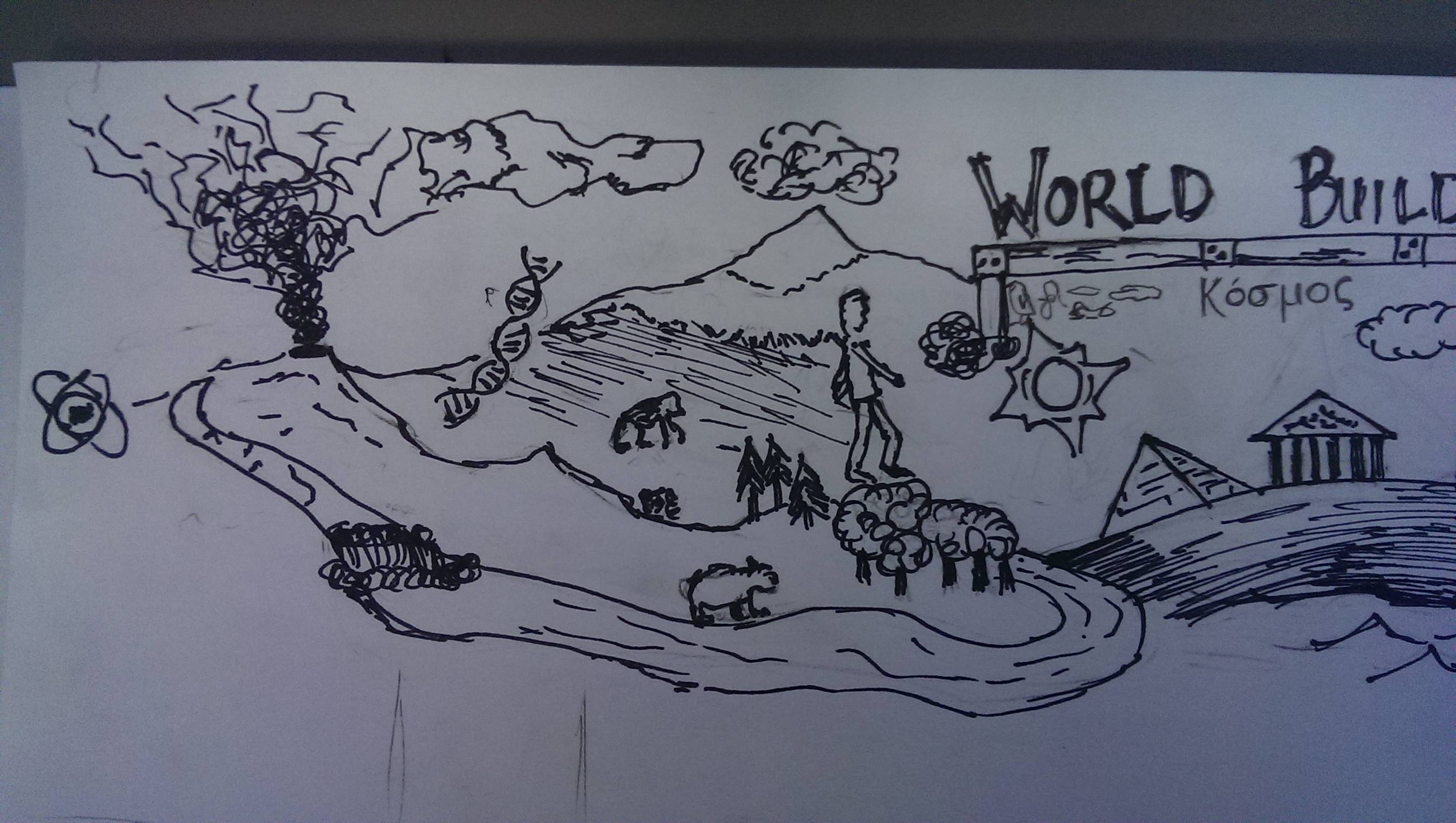
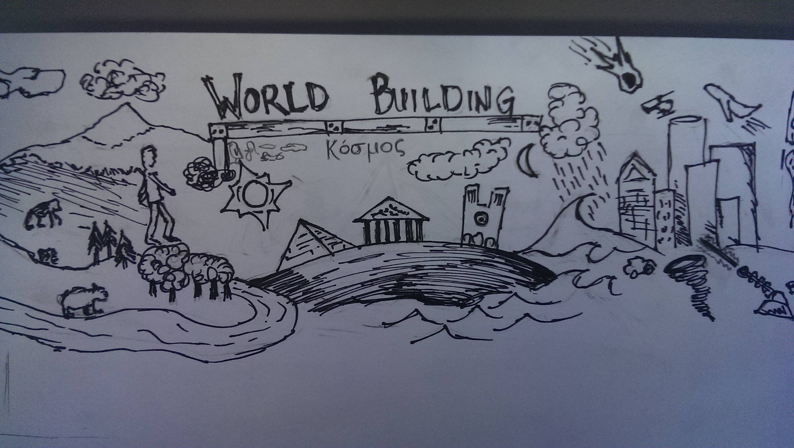
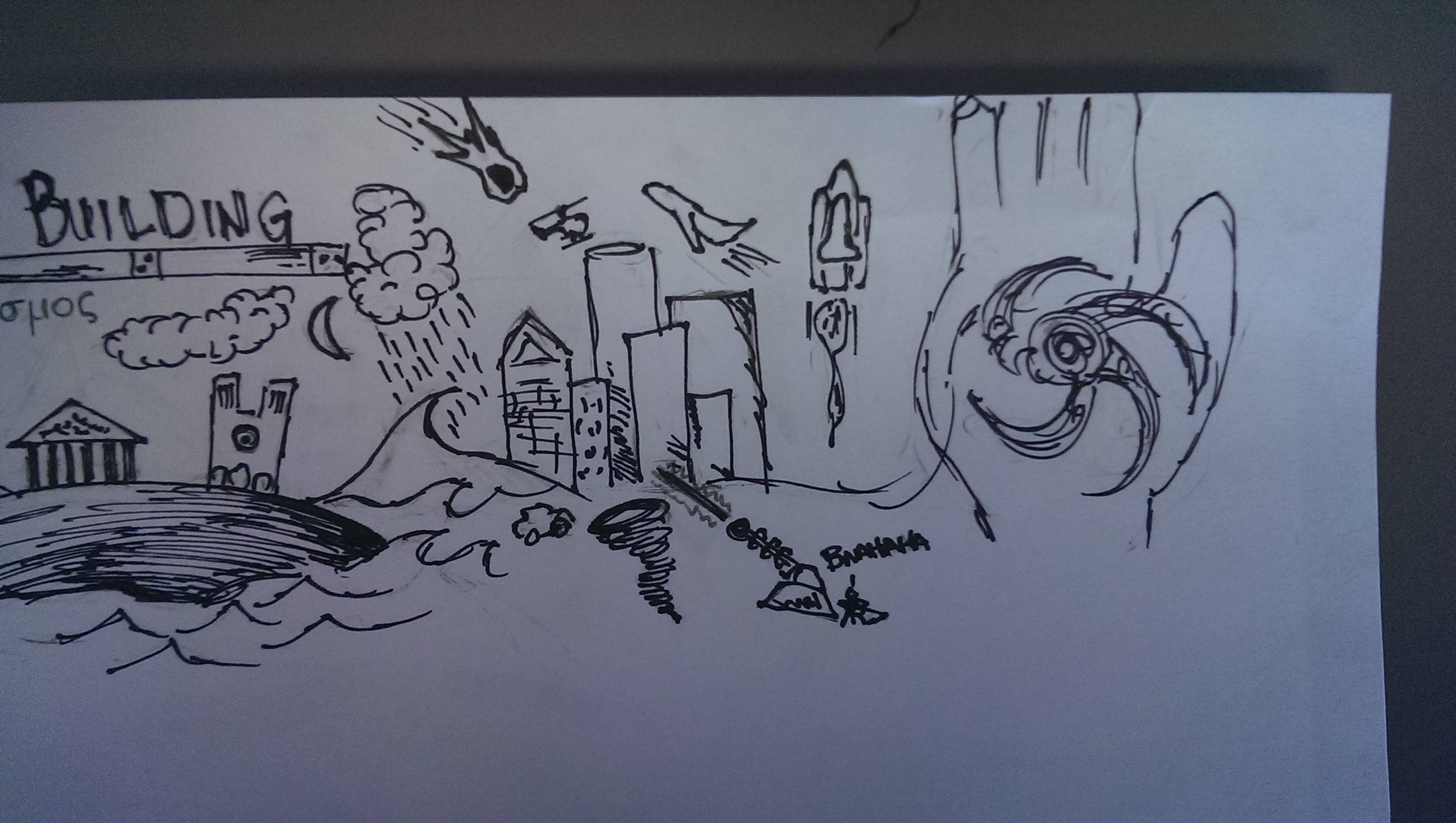
I am a little late to the party but here is my contribution/idea. Never mind the terrible drawing skills :) (oh the thing on the far right is a universe in a hand...)

Here is the full spread (details to follow)

enter image description here

And here are the close ups

enter image description here

enter image description here

enter image description here

$\endgroup$
3
  • $\begingroup$ A "bit" late comment, but +1 for the greek Κόσμος ( = Freedom). Where did you get that? $\endgroup$
    – user22613
    Commented Sep 13, 2016 at 18:36
  • $\begingroup$ @RudolfL.Jelínek Google Translate is a world builders friend ;) $\endgroup$
    – James
    Commented Sep 13, 2016 at 18:37
  • $\begingroup$ And mainly my friend, since I'm half Greek and half Czech, so my english is... $\endgroup$
    – user22613
    Commented Sep 13, 2016 at 18:40
8
$\begingroup$

I'd like the design to not be too obtrusive or "in your face". A lot of people browse the site from work and we don't want to discourage them from doing so.

For images itself our discussion on the Worldbuilding site advert has some relevant ideas:

Creating an ad for community promotion

I definitely like Frostfyre's suggestions, in particular a hand painting a world should work as a variable size icon. Maybe even have a bit of the world missing and the paint is filling it in. That detail might disappear at the smallest size but be visible in the larger ones.

$\endgroup$
9
  • $\begingroup$ I like the idea of a hand painting a world as an icon, if it works at small scale. $\endgroup$
    – Monica Cellio Mod
    Commented Dec 18, 2015 at 14:15
  • 4
    $\begingroup$ I second not being "in your face" - the "Science Fiction and Fantasy SE" isn't too bad in that regard, but I still feel weird if its up on my screen at work. $\endgroup$ Commented Dec 18, 2015 at 18:53
  • 1
    $\begingroup$ I think avoiding "in your face" designs pretty much points to dark deep space views, low contrast for the banner/background. $\endgroup$
    – mechalynx
    Commented Dec 21, 2015 at 16:07
  • 2
    $\begingroup$ Well the banner at the top isn't too bad as you can scroll down from it so long as the rest of the page is reasonably tame $\endgroup$
    – Tim B Mod
    Commented Dec 21, 2015 at 16:50
  • $\begingroup$ I concur, utterly, with all the comments here. That said, there are other directions to go besides black, (which is fine) such as grey and highlight colors, or organic hues. Various paper textures can look pretty nice, for example. If a dark theme is preferred, that's cool, but that's not the only way to avoid the problem. $\endgroup$
    – The Nate
    Commented Jan 8, 2016 at 12:58
  • $\begingroup$ Well I don't think it needs to be dark, so much as not look out-of-place in a workplace context. $\endgroup$
    – Tim B Mod
    Commented Jan 8, 2016 at 13:01
  • $\begingroup$ Your first paragraph cannot be understated. The thing I hate most about being on the SciFi site at work is how much it looks like a SciFi site. $\endgroup$
    – corsiKa
    Commented Jan 10, 2016 at 6:31
  • $\begingroup$ @corsiKa I think you mean overstated :) $\endgroup$
    – Tim B Mod
    Commented Jan 10, 2016 at 13:01
  • $\begingroup$ @Tim Apparently, words have definitions? Dammit, I'm so bad at this... If only there were multiple sites on Stack Exchange I could go to for help with this kind of thing... $\endgroup$
    – corsiKa
    Commented Jan 11, 2016 at 0:17
7
$\begingroup$

Blog tie-in

Are there any ways that the site should visually connect with the medium blog?

That's a great question! I would like to see some connection between the site and the blog. But we don't need to feel bound by the current design of the blog; we can adjust that to fit the site design.

We -- by which I mean @ArtofCode -- created the blog design from scratch because there were no design elements here that it made sense to use. The generic white "WB" on a light blue background just didn't do it for us, y'know? I think that if we'd already had a site design, though, we would have tied into that. And while I don't want to speak for the people who'll be doing the work, I think it's reasonable that we could incorporate WB.SE design elements into the blog.

I think "incorporate" rather than "copy" is the right approach; the Q&A site and the blog are different sites, though closely related, so they should look related but not the same. If there's something on the blog that you'd like to pull in, go for it -- but we can go the other direction too.

$\endgroup$
1
  • $\begingroup$ Aye, sounds about right. I can throw the information about the design to the team if y'all want it, or copies of the original files. $\endgroup$
    – ArtOfCode
    Commented Dec 22, 2015 at 0:05
4
$\begingroup$

This is based in large part on The Nate's suggestion of a blueprint site icon, but adds a bit to it.

  • A blueprint of a planet for the site favicon.
  • Blueprint theme for the voting arrows and similar controls.
  • EDITED TO ADD: Blueprint background surrounding the site main content area (compare the grids over on Electrical Engineering and Role-Playing Games)

I think it's safe to say that lots of people, even those far removed from the engineering professions, at least recognize a blueprint. It also should be easy to make work in a wide variety of sizes.

Something like this would be low-key, definitely doesn't scream "this is all fun and games" (like Monica pointed out, we do serious work too!), yet is a distinctive design that I don't think I've seen anywhere else on the network (and I can't think of any site elsewhere that it would be obviously confusable with).

$\endgroup$
2
  • 1
    $\begingroup$ diy.stackexchange.com is already using the blueprint $\endgroup$ Commented Jan 13, 2016 at 19:20
  • $\begingroup$ @tepples Ah well that's a bummer. $\endgroup$
    – user Mod
    Commented Jan 14, 2016 at 8:43
3
$\begingroup$

A white on blue sketch of a planet would evoke a blueprint and work at rather low res.. A thought balloon around that could be interesting. Details, of course, can be added as resolution increases... at least for the site favicon.

As to special other art, it's hard to pick between sci fi and fantasy themes... Could look a bit like role playing or TeX or more modern, with sans serif fonts and really clean and clear controls and icons.

It'd be really neat if we could have a site setting to pick which stylesheet appealed, but that might be too much work.

$\endgroup$
1
  • $\begingroup$ I like the blueprint idea. Sounds like it could work very well for the site's icon, at least. $\endgroup$
    – user Mod
    Commented Jan 4, 2016 at 15:33
1
$\begingroup$

I come much later (I was away for some time), but if I like some of the previous examples for banners, they seem overloaded. How about something like

enter image description here

Please excuse the low quality, I only had a mouse around me.

So the idea is that a wizzard and a "metallurgist" using arc welding are building a planet (identified by continents and water), based on the blue prints that a robot and a buisness man are discussing over. Meanwhile a Faerie riding a dragons goes on lightning stars.

$\endgroup$
-2
$\begingroup$

How about a generic profile of a head and a lightning bolt inside(brainstorm) then design orbiting around head planets or worlds moons or Suns looking like a galaxy? Sorry no picture just an idea

$\endgroup$
1
  • 2
    $\begingroup$ We don't do brainstorming, we do specific Q&A. Besides, I doubt many would make the connection from "head and lightning bolt" to "brainstorming". $\endgroup$
    – user Mod
    Commented Jan 4, 2016 at 15:32
-3
$\begingroup$

enter image description here

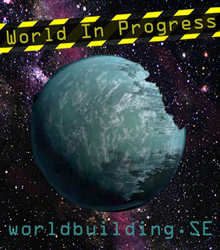
Like the ad below but put the caution tape around the middle. I think that would scale well with a little adjustment. Less stars, less purple; use the background from the grey one.

enter image description here

$\endgroup$
2
  • $\begingroup$ Is that a meridian trench? $\endgroup$ Commented Jan 13, 2016 at 16:00
  • 2
    $\begingroup$ @tepples - That's my mad MSpaint skills representing caution tape. $\endgroup$
    – Mazura
    Commented Jan 13, 2016 at 18:45

You must log in to answer this question.

Not the answer you're looking for? Browse other questions tagged .